


COVID death data can be shared to make it look like vaccines don't work, or worse – but that's not the whole picture
- Written by: Jacques Raubenheimer, Senior Research Fellow, Biostatistics, University of Sydney

Social media posts commenting on data from the UK[1], Israel[2] and South Africa[3], among others, claim deaths from COVID (or all deaths[4]) are now higher in vaccinated than unvaccinated citizens. Others make the more moderate claim vaccines do nothing[5] to prevent death from COVID.
These reports appear intimidating, because they usually utilise real data or statistics. Many of the raw numbers presented[6] are indeed correct, though not complete.
But people – including Clive Palmer[7] who said this week vaccines don’t work and Craig Kelly[8] who spread vaccine misinformation via text message – should ask whether they have understood the context, analysed the data properly and interpreted the results accurately.
Read more: No, vaccinated people are not 'just as infectious' as unvaccinated people if they get COVID[9]
What counts as ‘vaccinated’?
When comparing studies or statistics, a lot hinges on how data providers define “vaccinated”.
Some vaccines are single-dose, others are double-dose regimens. Most jurisdictions define “fully vaccinated” as two weeks after the last required dose, but some social media posts like this one[10] lump together anyone who has had any dose.
Some jurisdictions track patients in the interim period, others more crudely lump them with the partially vaccinated. We also have to compare patients who have received different vaccines, or mixed vaccine doses. Soon we will have to track those who have received booster shots.
To complicate things further, not all jurisdictions publish the necessary level of detail. Thankfully, we do have some good data at our fingertips: NSW is on track[11] to become one of the most highly vaccinated jurisdictions[12] in the world, and has published[13] very detailed data with comparisons between vaccinated and unvaccinated cases[14] that show vaccination is highly effective.

Read more: Now everyone's a statistician. Here's what armchair COVID experts are getting wrong[16]
Not all numbers are equal
Focusing on an absolute number[17] – how far it is from zero, regardless of its relative value in the real world – can be very misleading.
Let’s say 95% of NSW’s entire population[18] of approximately 8,000,000 was fully vaccinated. That’s 7.6 million people. Imagine 0.05% of fully vaccinated people needed to be hospitalised with COVID. That’s just shy of 4,000 people.
Let’s also say 1% of the remaining 400,000 unvaccinated people were hospitalised with COVID. That’s 4,000 people.
So the absolute number of hospitalised vaccinated people would be similar to the hospitalised unvaccinated people.
But, less than 0.05% of fully vaccinated people are in hospital, compared to 1% of unvaccinated people – that’s 20 times higher!
The same scenario could be applied to absolute numbers of COVID deaths.
Another way to explain this relates to what’s known as Simpon’s paradox[19]: when a very large proportion of the population is vaccinated[20], it is quite likely that a larger absolute number of cases will be vaccinated rather than unvaccinated. To compare effects, one must instead focus on the rates of cases and death[21] from COVID.
COVID doesn’t affect everyone in the same way
COVID hospitalisation and death rates are skewed sharply by sex[22], pre-existing health conditions like metabolic syndrome[23], and age[24]. So, men are more likely to die than women and the same is true for older people and those with other health problems.
And almost all countries vaccinated the most at-risk populations first. Some, like the elderly, already displayed higher death rates. Given the most likely to die are the first vaccinated, then we may see more deaths in the group vaccinated first. The vaccine will have lessened the deaths, but at-risk people were always more likely to die.
To truly discern the effect of the vaccine, then, one has to compare rates across matched levels of risk, especially age[25]. A very good analysis matches different levels of age risk on the Israeli data[26] and shows that even though the absolute number of vaccinated hospitalised cases was more than the unvaccinated hospitalisations, the Pfizer vaccine still showed good effectiveness against severe disease.
The two charts below, prepared from figures via Our World in Data[27], show the cases, deaths, and vaccinations for Israel[28] and the UK[29] across the entire pandemic. Both experienced three waves, with the third being after the start of vaccinations. Both showed dramatically fewer deaths in the third wave, even though case numbers were high (for Israel, the highest of the three waves[30]).
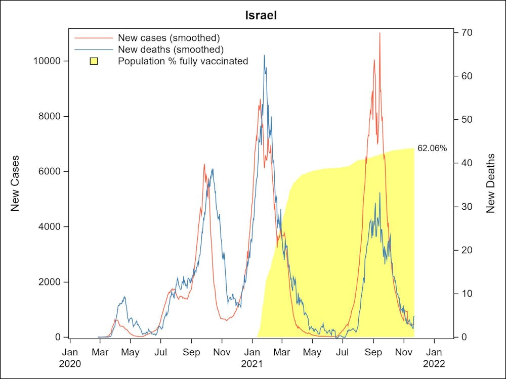 Israel.
Author compiled from ourworldindata.org, CC BY[31][32]
Israel.
Author compiled from ourworldindata.org, CC BY[31][32]
 Author compiled from ourworldindata.org, CC BY[33][34]
Some posts like this one[35] claim to show “vaccine-caused mortality” but ignore uneven risk across the population[36]. The rates are higher for unvaccinated people in all other age groups (conveniently omitted from the chart) and, more importantly, the data report states:
For the 10–59 age group, the vaccinated population will on average be older than the unvaccinated population … As mortality rates are higher for older people, this will increase the mortality rates for the vaccinated population compared to the unvaccinated population.
Making sense of all the numbers
We know there are “lies, damned lies, and statistics[37]”. And yet, some spurious social media claims rely on real numbers.
So the question isn’t: should you believe the statistics? Rather: which statistics should you believe? The best advice is to step back and look at the bigger picture.
When this pandemic winds down, there could be a day when there is only one hospitalised COVID patient. If that patient were to be vaccinated, would we say that 100% of hospitalised patients are vaccinated, and therefore the vaccines don’t work?
We need to look at the numbers over the whole course of the pandemic, or even over a single wave of infection, to see things more clearly. A single set of numbers does not show the whole picture.
Read more:
Why are COVID cases in India decreasing, despite the low double vaccination rate?[38]
References^ the UK (twitter.com)^ Israel (www.facebook.com)^ South Africa (www.facebook.com)^ or all deaths (twitter.com)^ vaccines do nothing (www.theguardian.com)^ Many of the raw numbers presented (www.gov.uk)^ Clive Palmer (www.theguardian.com)^ Craig Kelly (www.smh.com.au)^ No, vaccinated people are not 'just as infectious' as unvaccinated people if they get COVID (theconversation.com)^ this one (archive.md)^ is on track (www.health.nsw.gov.au)^ highly vaccinated jurisdictions (ourworldindata.org)^ published (www.health.nsw.gov.au)^ comparisons between vaccinated and unvaccinated cases (www.health.nsw.gov.au)^ EPA/ANDY RAIN (photos-cdn.aap.com.au)^ Now everyone's a statistician. Here's what armchair COVID experts are getting wrong (theconversation.com)^ absolute number (www.mathsisfun.com)^ NSW’s entire population (stat.data.abs.gov.au)^ Simpon’s paradox (www.washingtonpost.com)^ large proportion of the population is vaccinated (www.abc.net.au)^ focus on the rates of cases and death (ourworldindata.org)^ sex (www.nature.com)^ metabolic syndrome (journals.plos.org)^ age (www.bmj.com)^ especially age (www.theguardian.com)^ analysis matches different levels of age risk on the Israeli data (www.covid-datascience.com)^ Our World in Data (ourworldindata.org)^ Israel (ourworldindata.org)^ the UK (ourworldindata.org)^ Israel, the highest of the three waves (www.abc.net.au)^ Author compiled from ourworldindata.org (ourworldindata.org)^ CC BY (creativecommons.org)^ Author compiled from ourworldindata.org (ourworldindata.org)^ CC BY (creativecommons.org)^ like this one (twitter.com)^ uneven risk across the population (www.ons.gov.uk)^ lies, damned lies, and statistics (www.goodreads.com)^ Why are COVID cases in India decreasing, despite the low double vaccination rate? (theconversation.com)
Author compiled from ourworldindata.org, CC BY[33][34]
Some posts like this one[35] claim to show “vaccine-caused mortality” but ignore uneven risk across the population[36]. The rates are higher for unvaccinated people in all other age groups (conveniently omitted from the chart) and, more importantly, the data report states:
For the 10–59 age group, the vaccinated population will on average be older than the unvaccinated population … As mortality rates are higher for older people, this will increase the mortality rates for the vaccinated population compared to the unvaccinated population.
Making sense of all the numbers
We know there are “lies, damned lies, and statistics[37]”. And yet, some spurious social media claims rely on real numbers.
So the question isn’t: should you believe the statistics? Rather: which statistics should you believe? The best advice is to step back and look at the bigger picture.
When this pandemic winds down, there could be a day when there is only one hospitalised COVID patient. If that patient were to be vaccinated, would we say that 100% of hospitalised patients are vaccinated, and therefore the vaccines don’t work?
We need to look at the numbers over the whole course of the pandemic, or even over a single wave of infection, to see things more clearly. A single set of numbers does not show the whole picture.
Read more:
Why are COVID cases in India decreasing, despite the low double vaccination rate?[38]
References^ the UK (twitter.com)^ Israel (www.facebook.com)^ South Africa (www.facebook.com)^ or all deaths (twitter.com)^ vaccines do nothing (www.theguardian.com)^ Many of the raw numbers presented (www.gov.uk)^ Clive Palmer (www.theguardian.com)^ Craig Kelly (www.smh.com.au)^ No, vaccinated people are not 'just as infectious' as unvaccinated people if they get COVID (theconversation.com)^ this one (archive.md)^ is on track (www.health.nsw.gov.au)^ highly vaccinated jurisdictions (ourworldindata.org)^ published (www.health.nsw.gov.au)^ comparisons between vaccinated and unvaccinated cases (www.health.nsw.gov.au)^ EPA/ANDY RAIN (photos-cdn.aap.com.au)^ Now everyone's a statistician. Here's what armchair COVID experts are getting wrong (theconversation.com)^ absolute number (www.mathsisfun.com)^ NSW’s entire population (stat.data.abs.gov.au)^ Simpon’s paradox (www.washingtonpost.com)^ large proportion of the population is vaccinated (www.abc.net.au)^ focus on the rates of cases and death (ourworldindata.org)^ sex (www.nature.com)^ metabolic syndrome (journals.plos.org)^ age (www.bmj.com)^ especially age (www.theguardian.com)^ analysis matches different levels of age risk on the Israeli data (www.covid-datascience.com)^ Our World in Data (ourworldindata.org)^ Israel (ourworldindata.org)^ the UK (ourworldindata.org)^ Israel, the highest of the three waves (www.abc.net.au)^ Author compiled from ourworldindata.org (ourworldindata.org)^ CC BY (creativecommons.org)^ Author compiled from ourworldindata.org (ourworldindata.org)^ CC BY (creativecommons.org)^ like this one (twitter.com)^ uneven risk across the population (www.ons.gov.uk)^ lies, damned lies, and statistics (www.goodreads.com)^ Why are COVID cases in India decreasing, despite the low double vaccination rate? (theconversation.com)